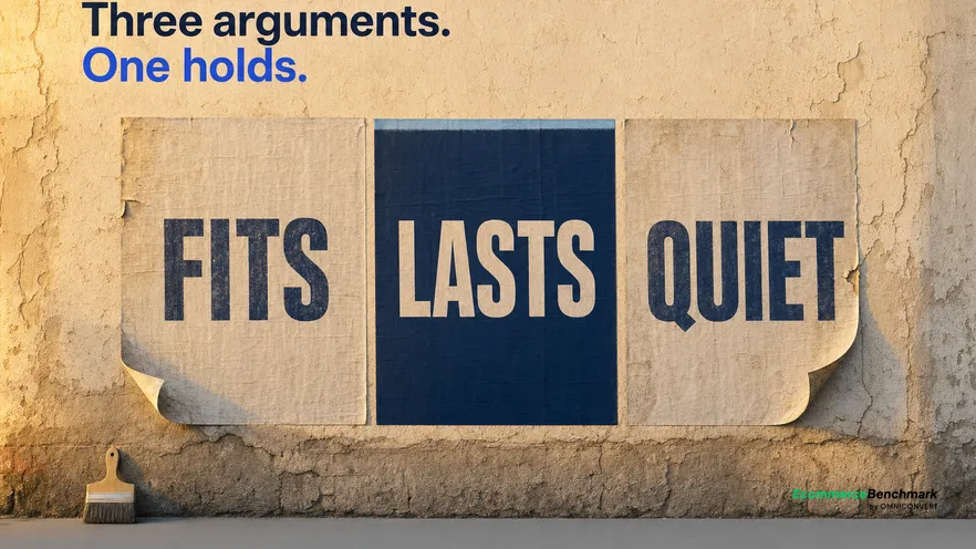
A high-converting ad is defined as one where three separable parts each do their own job. The hook earns attention, the angle argues why this product solves a specific problem for a specific person, and the call to action names the next step. Each fails in a different metric, so the first job is not writing a better ad. It is working out which of the three is broken.
- A high-converting ad has three separable parts: the hook, the angle, and the call to action.
- Each part fails in a different metric, so the drop-off tells you which one broke before you rewrite anything.
- Hooks fail at the opening moment, angles between attention and click, calls to action after the click.
- Angles are found rather than invented: your reviews, your support tickets, and the ads competitors keep running.
- Test one component at a time and file the result against that component, or nothing accumulates.
Most creative reviews are conducted on the wrong unit. A team looks at an underperforming high-converting ad, agrees it feels flat, and commissions a replacement that changes the opening, the argument and the closing line all at once. The new ad performs differently, nobody can say why, and the lesson does not transfer to the next one. A year of that produces a large creative library and very little accumulated knowledge. Last updated: August 2026.
Omniconvert has scored Creative and Ads as one of the six dimensions in the eCommerceBenchmark.ai store score, benchmarked against real competitors in your category and country, and the pattern behind weak creative scores is rarely a shortage of production. It is that the three components are treated as one thing, so diagnosis is impossible and every fix is a guess. Thirteen years in eCommerce and 70,000+ experiments behind the Omniconvert testing practice point the same way: the teams that compound are the ones that can name what they changed.
This guide takes the ad apart. What each component is actually responsible for, the metric that exposes each one, how to diagnose a failure in twenty minutes from numbers you already have, and how to test one part at a time so the result survives into your next creative.
The anatomy of a high-converting ad
Take each in turn, because the boundaries matter more than the definitions.
The hook is whatever happens in the first moment: the opening frame, the first line, the visual that interrupts a scroll. Its only job is to buy the next few seconds. It is not responsible for persuading anyone of anything, and asking it to carry the argument as well is a common cause of openings that are clever and ineffective.
The angle is the argument. Not the product's features, but the claim about why this product solves a particular problem for a particular person. The same product supports many angles: the same water bottle can be argued as the one that fits a bike frame, the one that survives a dishwasher, the one that does not sweat on a desk. Those are three genuinely different ads for three genuinely different buyers, and picking one is the strategic decision inside the creative.
The call to action names the next step and, more importantly, sets the expectation. It is the contract between the ad and the landing page. Most weak calls to action are not weak because they lack urgency. They are weak because they promise something the destination does not immediately deliver, which converts a click into a bounce.
Keep the three separate on paper before the ad is made. A brief that names the hook, the angle and the call to action as three lines is a brief you can diagnose later. A brief that says "make it feel premium and drive purchases" is not.
Where each part fails, and in which metric
This is the section that saves the most time, because it replaces a taste debate with a lookup.
A hook failure looks like a very low stop rate: almost nobody stayed past the first moment. Whatever the rest of the ad said is irrelevant, because it was never seen. Rewriting the angle here is the single most common wasted rewrite in performance creative, and it produces a second ad that also nobody watches.
An angle failure looks like healthy attention and poor click-through. People stayed, took in the argument, and were not moved by it. That is genuinely useful information: your hook is working and your claim is not landing with this audience. The response is a different argument, not a louder version of the same one.
A call to action failure looks like strong click-through and weak behaviour afterwards: quick bounces, thin engagement, poor add-to-cart. The ad wrote a cheque the page did not honour. Baymard Institute's research on how shoppers respond to unexpected costs and unclear terms is the useful reference here, because the mismatch usually involves a price, a delivery promise or a condition the ad implied and the page then corrected.
| Symptom | Failing part | The wrong fix | The right fix |
|---|---|---|---|
| Almost nobody stays past the opening | Hook | Rewrite the whole ad | Change only the opening moment |
| Good attention, few clicks | Angle | Add urgency to the close | Argue a different problem |
| Many clicks, instant bounce | Call to action | Blame the landing page design | Align the promise with the page |
| Strong start, then a cliff mid-ad | Angle, arriving too late | Shorten the whole ad | Move the claim earlier |
| Everything fine, results decaying | Angle, exhausted | Refresh the visuals | Retire the argument, not the format |
| Wins that never repeat | All three changed at once | Commission more variants | Isolate one part per test |
The last two rows describe the two most expensive habits in the category. Refreshing visuals when the argument is what has worn out produces a new-looking ad that decays at the same rate. And a win nobody can attribute is a win that cannot be repeated, which is how teams end up with a library of past successes and no working theory.
Writing each part properly
Some practical constraints for each, drawn from what survives testing rather than from what wins awards.
Hooks. Specificity outperforms cleverness with reliable regularity, because a specific opening self-selects the right audience while a clever one entertains everybody. The other durable finding is that a hook must be true to the ad that follows it. A mismatched hook buys attention it immediately loses, and it teaches the platform to show your ad to people who do not want it.
Angles. Write the buyer and the problem down before writing the ad. One sentence: this is for someone who has this problem, and here is why this product resolves it. If that sentence is vague, the ad will be vague and no amount of production will fix it. Then hold each angle as a separate line of creative rather than blending three arguments into one ad, which is the most common way a strong angle gets buried.
Calls to action. Describe the next screen. "See the sizes" outperforms "Shop now" when the next screen is a size guide, because the click and the destination agree. Escalating pressure raises click volume and lowers click quality, which is a bad trade whenever your economics depend on the second purchase rather than the first. The simplest test of a call to action is to read it aloud beside a screenshot of the page it opens, and ask whether the two are describing the same thing. Surprisingly often they are not, and nobody had checked, because the ad and the landing page were built by different people in different weeks.
Where new angles actually come from
The hardest part of the framework is supplying genuinely distinct angles, because a team that has lived with a product for two years has usually run out of ways to think about it. The way out is to stop generating and start collecting.
Your own reviews are the first source and the most underused. Read a hundred of them and sort by the problem the customer says the product solved, not by rating. The clusters that emerge are angles, phrased by the people you are trying to reach. A recurring line like "finally one that fits under the sink" is a complete angle: buyer, problem, resolution. It also arrives pre-tested, because somebody bought the product for that reason and was satisfied enough to write it down.
Support tickets are the second, and they carry the objections. Every repeated pre-purchase question is a doubt your current ads are not resolving, and an angle built to answer it addresses hesitation rather than desire. These tend to perform well with colder audiences, since a cold buyer is closer to the doubt than to the aspiration.
Competitor ads are the third, read for persistence rather than for volume. Public ad libraries show what is live, and the useful signal is longevity: most creative is paused quickly, so an ad still running after months has almost certainly earned it. What you are looking for is not the execution but the argument underneath. If three rivals independently keep an ad arguing durability, durability is a live concern in your category and you should have an angle for it, in your own words and with your own proof.
Two cautions. Do not copy a competitor's execution, because you inherit their hook and their tone without their context and it reads as thin. And resist the urge to merge the strongest three findings into one ad, which is how a brief with three good angles becomes one crowded ad that makes no argument clearly. Keep them separate and let the test decide which problem your buyer actually cares about most.
Competitor angles are public. Meta’s own Ad Library research tools documentation explains what the library exposes, which is enough to collect the arguments a category already makes before you write your own.
Testing one part at a time
- Vary one component per test. Same angle and call to action, three different hooks. Then same hook and call to action, three different angles. Slower per cycle, and the only version that produces transferable knowledge.
- Give it a real window. Meta's own guidance on campaign learning is consistent that early results are unstable while delivery is still settling, so a verdict taken in the first days is usually a verdict about the platform rather than about your creative.
- File results by component. Keep a record of hooks that worked, angles that worked and calls to action that worked, separately. After a few quarters this file is worth more than the creative library, because it is what makes the next ad better rather than merely newer.
- Record the failures too. An angle that did not land is a fact about your customers, and it stops the same idea being re-proposed every planning cycle.
The same discipline is what makes site-side testing trustworthy, and the two halves compound: creative decides who arrives and with what expectation, the storefront decides what happens next. The full growth system covers how those pieces fit together as one programme, and Omniconvert Explore is the CRO platform that handles the on-site half with controlled tests rather than before-and-after comparisons.
What a media buyer should do this week
- Label every live ad with its three components. A spreadsheet, one row per ad, three columns. Most teams discover they are running one angle in eight costumes.
- Pull the drop-off for your worst performer. Find where people leave and diagnose it against the table above. Twenty minutes, and it usually contradicts the room's assumption.
- Write three genuinely different angles for one product. Different buyer, different problem, not different wording. This is the highest-value hour available to a creative team.
- Start the component results file. Hooks, angles and calls to action, with outcomes, including the failures. It compounds from the first entry.
To see how your creative compares with real competitors in your category and country, alongside the five other dimensions a store is scored on including AI Visibility and Agentic Commerce, start with a free store benchmark score. Teams that want the same loop run across the whole growth stack can see how Nexus by Omniconvert unifies commerce data and ranks the experiments worth running, with a human approving what goes live.
What better ads will not fix
Three limits, stated plainly.
First, the offer sets the ceiling. If a shopper can find the same product cheaper, faster or with better return terms, the best-argued ad in your category delivers a well-qualified visitor to that comparison. Creative decides who arrives; it does not decide what they find.
Second, an ad cannot repair the storefront it points at. Sending better-qualified traffic to a checkout that fails on mobile converts a media problem into a more expensive media problem. Fixing the destination first is nearly always the higher-return sequence, which is why our companion guides on tactical conversion fixes exist alongside this one.
Third, creative cannot rescue acquisition economics that do not work. If the first purchase loses money and nothing brings the customer back, better ads buy the loss faster. Bain and Company's retention research holds that a five percent improvement in retention can raise profits by twenty-five to ninety-five percent, which is the arithmetic that decides whether a creative programme is an investment or an accelerant.
A strong creative still needs the right campaign structure around it to be judged fairly, which is the subject of ABO vs CBO.
The bottom line
Stop reviewing ads as single objects. Name the hook, the angle and the call to action before production, read the drop-off to find which one failed, and change that one. The discipline is unglamorous and it converts creative from a taste debate into a diagnosis, which is the difference between a team that produces more ads each quarter and a team that produces better ones. File the results by component, keep the failures, and within a couple of quarters the file starts writing the briefs. A high-converting ad is rarely a flash of inspiration. It is usually a good angle that somebody found by testing three, attached to a hook that earned the time to make it.